Product
7
MIN READ
How to optimize your ecommerce checkout for higher conversion?


Table of contents
In any ecommerce, the checkout is a decisive point. It is the last step before conversion, and at the same time, the place where most friction occurs.
The Baymard Institute, which has been researching online shopping experience for over a decade, makes it clear: the design and flow of the checkout are one of the main causes of cart abandonment.
If the buyer encounters a confusing payment process or one that generates distrust, it is likely that they will abandon the purchase and not return, looking for an alternative.
Why are there poorly optimized checkouts?
Because optimizing the checkout is not always straightforward and many merchants face technical or integration barriers:
Changes often require code or CSS adjustments (which means adding work for the technical team).
Payment methods are not easily added in the payment process.
Redirections that interrupt the buyer are difficult to avoid if the merchant does not meet certain requirements (such as being PCI compliant or being able to capture cards).
In practice, this means that improving the checkout requires technical resources that are not always available. But it does not always have to be this way, and below we will explore how to optimize your checkout.
Reflect your brand to generate trust
It is very important that the payment experience reflects the visual identity of the ecommerce: colors, typography, layout of fields, the header... everything matters.
A coherent and polished visual environment builds trust and makes the buyer feel like they are still inside the store, reducing abandonment.
Also, the shorter and clearer the flow, the less the chances of abandonment. According to Baymard, an optimized checkout can recover up to 35% of sales lost due to cart abandonment.
At Zru we offer Themes, a visual editor from which you can customize the payment experience in detail with just a few clicks: adjust colors, logos, fields, and buttons, and create a checkout that is coherent with your brand that conveys trust.
Adapt payment methods to each buyer
Not all buyers want to pay in the same way. An optimized checkout adapts the payment options to the buyer's context to reduce friction and boost conversion:
Segment payment methods
Payment segmentation allows you to decide which methods are shown based on order and user variables: website language, currency, amount, device, customer type, etc.
For example, in countries where there are locally adopted methods like iDEAL in the Netherlands or Bancontact in Belgium, offering them improves conversion.
The amount also influences. For high-ticket items, it is advisable to show purchase financing methods to reduce cart abandonment or even increase the average ticket.
Order payment methods dynamically
The order in which payment methods are displayed also influences conversion: show the option that has the highest probability of success based on the context first.
Stripe has shown that dynamically ordering payment methods based on context can increase revenues by up to 10.5%. In practice, this means that the same checkout can behave differently depending on who uses it, prioritizing what converts best in each case.
Use wallets like Apple Pay or Google Pay
Using wallets such as Apple Pay or Google Pay also improves conversion by reducing steps, removing friction, and preventing buyers from having to look for their card and enter details manually.
Use orchestration to optimize the flow
Payment orchestration allows you to optimize each transaction’s path to improve authorization rates, reduce declines, and lower processing costs.
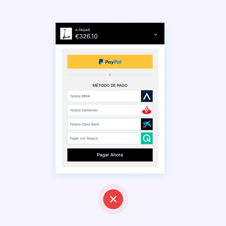
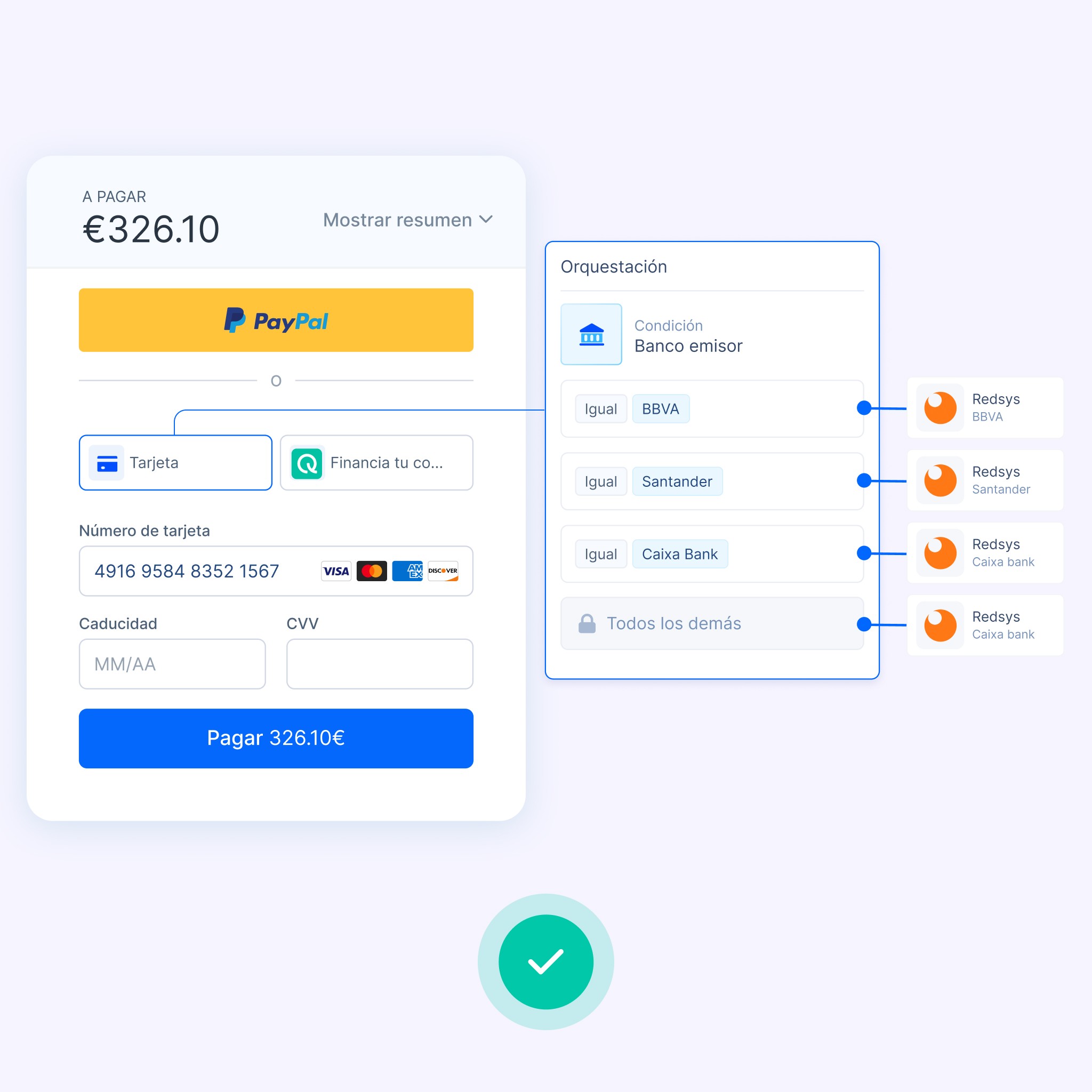
Some checkouts, on the other hand, lack an orchestration system and leave the choice to the buyer. In these cases, several options are shown based on the issuing bank of the card: “BBVA card”, “Santander card”, “Caixa card”, etc.
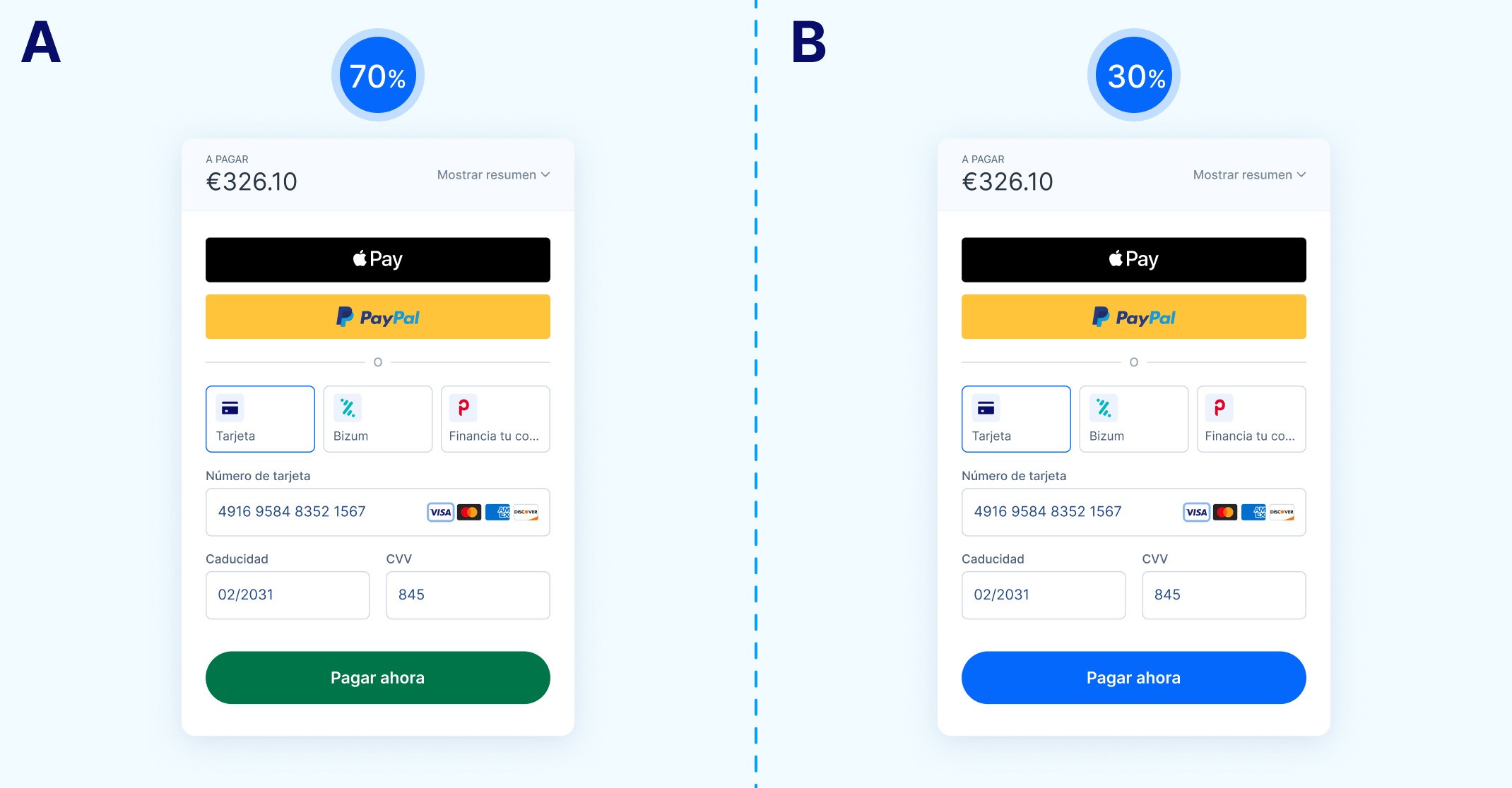
Besides being unintuitive, this can create friction and cause the user to abandon the payment. In the next image, we see an example of a checkout that could be optimized with orchestration
Ideally, orchestration should automatically detect the issuing bank and route the transaction through the best available option.
This is how it works with solutions like Zru: the buyer only sees one card payment option, but behind it, there is an intelligent process that decides the best route to approve the transaction.
In addition, orchestration makes it possible to:
Apply agnostic 3DS rules, activating it only when necessary and allowing authentication to work across different processors.
Reduce processing costs by routing the transaction through the most convenient provider in each case, based on variables like the card, the country, or the amount.
Prioritize UX and mobile-first design
Most online purchases are completed from mobile devices, so the checkout design must be conceived with that in mind. The design must be responsive, adapting to any screen size while maintaining the same fluid experience on mobile, tablet, or computer.
Loading speed is equally important: a checkout that takes time to display elements or respond can break the experience and cause the buyer to abandon.
Measure and improve with A/B testing
Once you have the optimized checkout, the next step is to measure its performance and continue adjusting it to improve conversion.
A simple way to do this is with A/B testing: it consists of duplicating the checkout, making a single modification, and showing each version to 50% of the buyers. This way you can see which version performs better and why.
It is important not to apply more than one change at a time, because if multiple elements are modified, the results will not clearly show what influenced the conversion.
Some elements that can be measured:
Which payment method converts better within the same type (for example, purchase financing or payment initiation).
Which field format works best: floating label or label above.
The order in which payment methods are displayed.
Cart design.
How Zru can help you optimize your checkout
An optimized checkout not only improves the conversion of your online store, but also reduces processing costs and simplifies payment management.
To achieve this, having a solution like Zru allows you to do it without relying on the technical team. From the checkout editor, you can configure colors, payment methods, field order, or orchestration rules with just a few clicks, and see the results instantly, both on desktop and mobile.
If you want to enhance the payment experience and increase your conversions, our team can help you set up the flow that best fits your business and your customers.
In this article, we explain in more detail what a payment orchestrator is: “What is a payment orchestrator?”
Product
7
MIN READ
How to optimize your ecommerce checkout for higher conversion?
Table of contents
In any ecommerce, the checkout is a decisive point. It is the last step before conversion, and at the same time, the place where most friction occurs.
The Baymard Institute, which has been researching online shopping experience for over a decade, makes it clear: the design and flow of the checkout are one of the main causes of cart abandonment.
If the buyer encounters a confusing payment process or one that generates distrust, it is likely that they will abandon the purchase and not return, looking for an alternative.
Why are there poorly optimized checkouts?
Because optimizing the checkout is not always straightforward and many merchants face technical or integration barriers:
Changes often require code or CSS adjustments (which means adding work for the technical team).
Payment methods are not easily added in the payment process.
Redirections that interrupt the buyer are difficult to avoid if the merchant does not meet certain requirements (such as being PCI compliant or being able to capture cards).
In practice, this means that improving the checkout requires technical resources that are not always available. But it does not always have to be this way, and below we will explore how to optimize your checkout.
Reflect your brand to generate trust
It is very important that the payment experience reflects the visual identity of the ecommerce: colors, typography, layout of fields, the header... everything matters.
A coherent and polished visual environment builds trust and makes the buyer feel like they are still inside the store, reducing abandonment.
Also, the shorter and clearer the flow, the less the chances of abandonment. According to Baymard, an optimized checkout can recover up to 35% of sales lost due to cart abandonment.
At Zru we offer Themes, a visual editor from which you can customize the payment experience in detail with just a few clicks: adjust colors, logos, fields, and buttons, and create a checkout that is coherent with your brand that conveys trust.
Adapt payment methods to each buyer
Not all buyers want to pay in the same way. An optimized checkout adapts the payment options to the buyer's context to reduce friction and boost conversion:
Segment payment methods
Payment segmentation allows you to decide which methods are shown based on order and user variables: website language, currency, amount, device, customer type, etc.
For example, in countries where there are locally adopted methods like iDEAL in the Netherlands or Bancontact in Belgium, offering them improves conversion.
The amount also influences. For high-ticket items, it is advisable to show purchase financing methods to reduce cart abandonment or even increase the average ticket.
Order payment methods dynamically
The order in which payment methods are displayed also influences conversion: show the option that has the highest probability of success based on the context first.
Stripe has shown that dynamically ordering payment methods based on context can increase revenues by up to 10.5%. In practice, this means that the same checkout can behave differently depending on who uses it, prioritizing what converts best in each case.
Use wallets like Apple Pay or Google Pay
Using wallets such as Apple Pay or Google Pay also improves conversion by reducing steps, removing friction, and preventing buyers from having to look for their card and enter details manually.
Use orchestration to optimize the flow
Payment orchestration allows you to optimize each transaction’s path to improve authorization rates, reduce declines, and lower processing costs.
Some checkouts, on the other hand, lack an orchestration system and leave the choice to the buyer. In these cases, several options are shown based on the issuing bank of the card: “BBVA card”, “Santander card”, “Caixa card”, etc.
Besides being unintuitive, this can create friction and cause the user to abandon the payment. In the next image, we see an example of a checkout that could be optimized with orchestration
Ideally, orchestration should automatically detect the issuing bank and route the transaction through the best available option.
This is how it works with solutions like Zru: the buyer only sees one card payment option, but behind it, there is an intelligent process that decides the best route to approve the transaction.
In addition, orchestration makes it possible to:
Apply agnostic 3DS rules, activating it only when necessary and allowing authentication to work across different processors.
Reduce processing costs by routing the transaction through the most convenient provider in each case, based on variables like the card, the country, or the amount.
Prioritize UX and mobile-first design
Most online purchases are completed from mobile devices, so the checkout design must be conceived with that in mind. The design must be responsive, adapting to any screen size while maintaining the same fluid experience on mobile, tablet, or computer.
Loading speed is equally important: a checkout that takes time to display elements or respond can break the experience and cause the buyer to abandon.
Measure and improve with A/B testing
Once you have the optimized checkout, the next step is to measure its performance and continue adjusting it to improve conversion.
A simple way to do this is with A/B testing: it consists of duplicating the checkout, making a single modification, and showing each version to 50% of the buyers. This way you can see which version performs better and why.
It is important not to apply more than one change at a time, because if multiple elements are modified, the results will not clearly show what influenced the conversion.
Some elements that can be measured:
Which payment method converts better within the same type (for example, purchase financing or payment initiation).
Which field format works best: floating label or label above.
The order in which payment methods are displayed.
Cart design.
How Zru can help you optimize your checkout
An optimized checkout not only improves the conversion of your online store, but also reduces processing costs and simplifies payment management.
To achieve this, having a solution like Zru allows you to do it without relying on the technical team. From the checkout editor, you can configure colors, payment methods, field order, or orchestration rules with just a few clicks, and see the results instantly, both on desktop and mobile.
If you want to enhance the payment experience and increase your conversions, our team can help you set up the flow that best fits your business and your customers.
In this article, we explain in more detail what a payment orchestrator is: “What is a payment orchestrator?”